UX Case Study
Animal Farmacy
Animal Farmacy
Homepage
Redesign
Improving search functionality, navigation clarity, and accessibility for an e-commerce platform serving farmers aged 57+.
Improving search functionality, navigation clarity, and accessibility for an e-commerce platform serving farmers aged 57+.
A real client. A real problem. And users who were being completely let down by the website meant to serve them.
When I started researching Animal Farmacy, I quickly discovered that their average user was a farmer aged 57+. People who genuinely wanted to buy online — but couldn't figure out how to search, couldn't navigate the menu, and were fighting with a site that wasn't built for them. My job was to fix that.
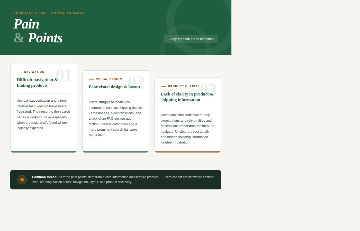
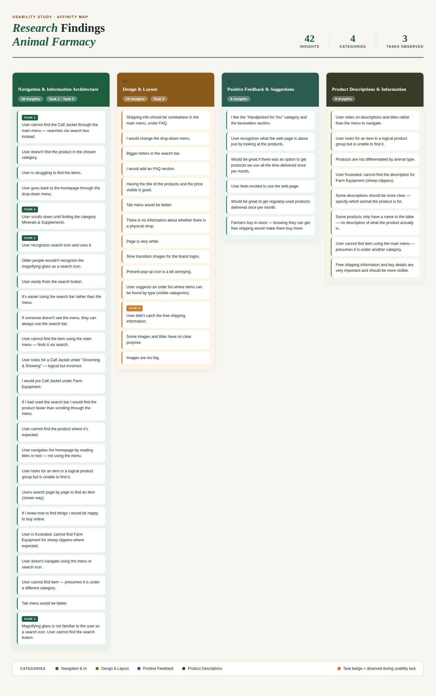
Users couldn't find the search bar. 40% of older users didn't recognise the magnifying glass icon — the only search entry point on the page.
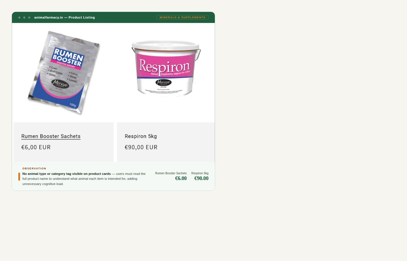
Product categories were too broad, mislabelled, and illogically grouped — causing users to rely on scrolling and trial-and-error instead of searching.
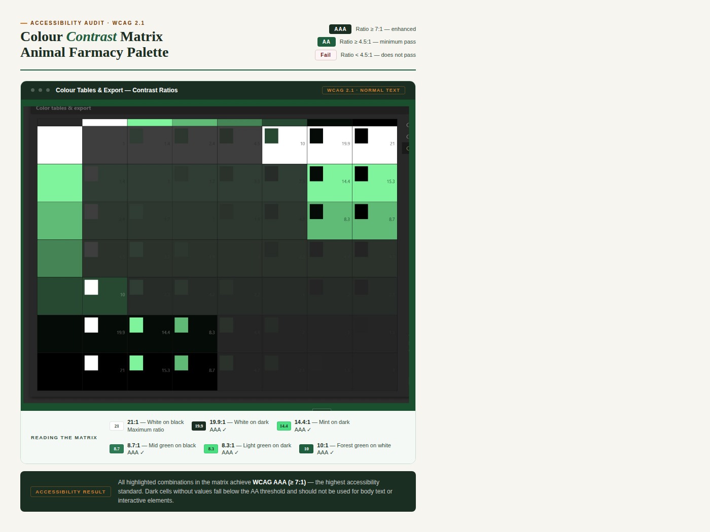
Text was too small, buttons too compact, and colour contrast failed WCAG standards — all critical issues for users aged 57+.
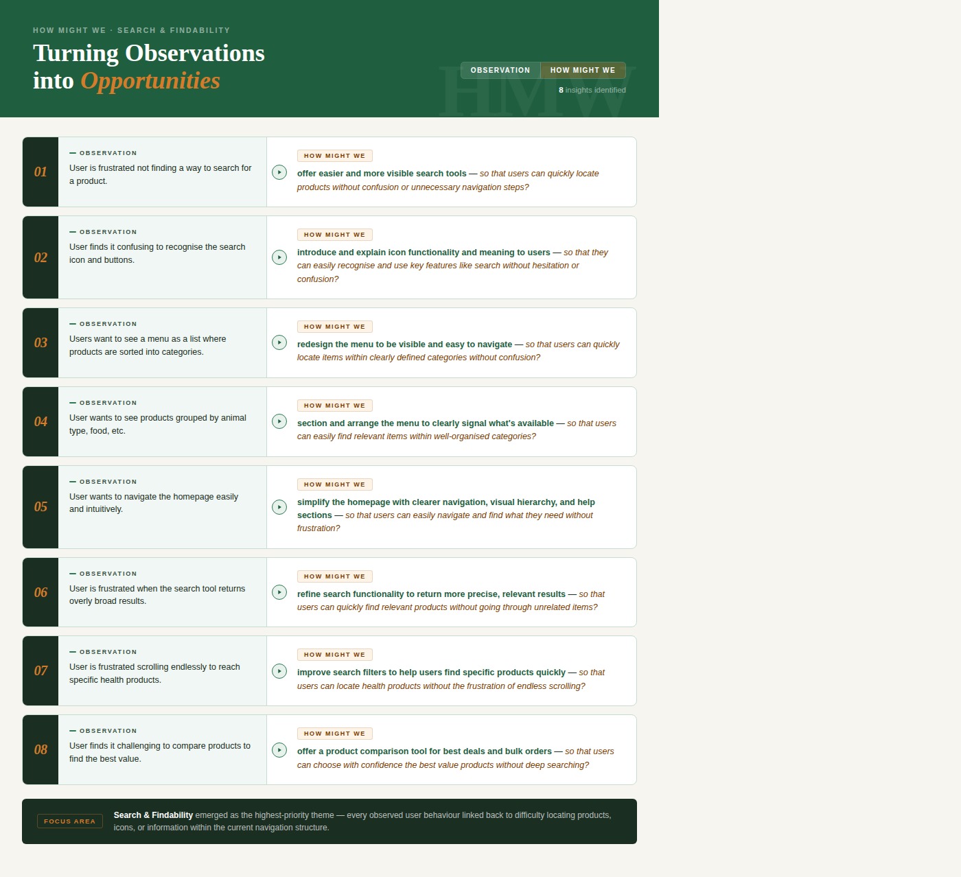
Three problems kept showing up everywhere in the research. They weren't separate issues — they were all symptoms of the same root cause: the site wasn't designed with this user in mind.
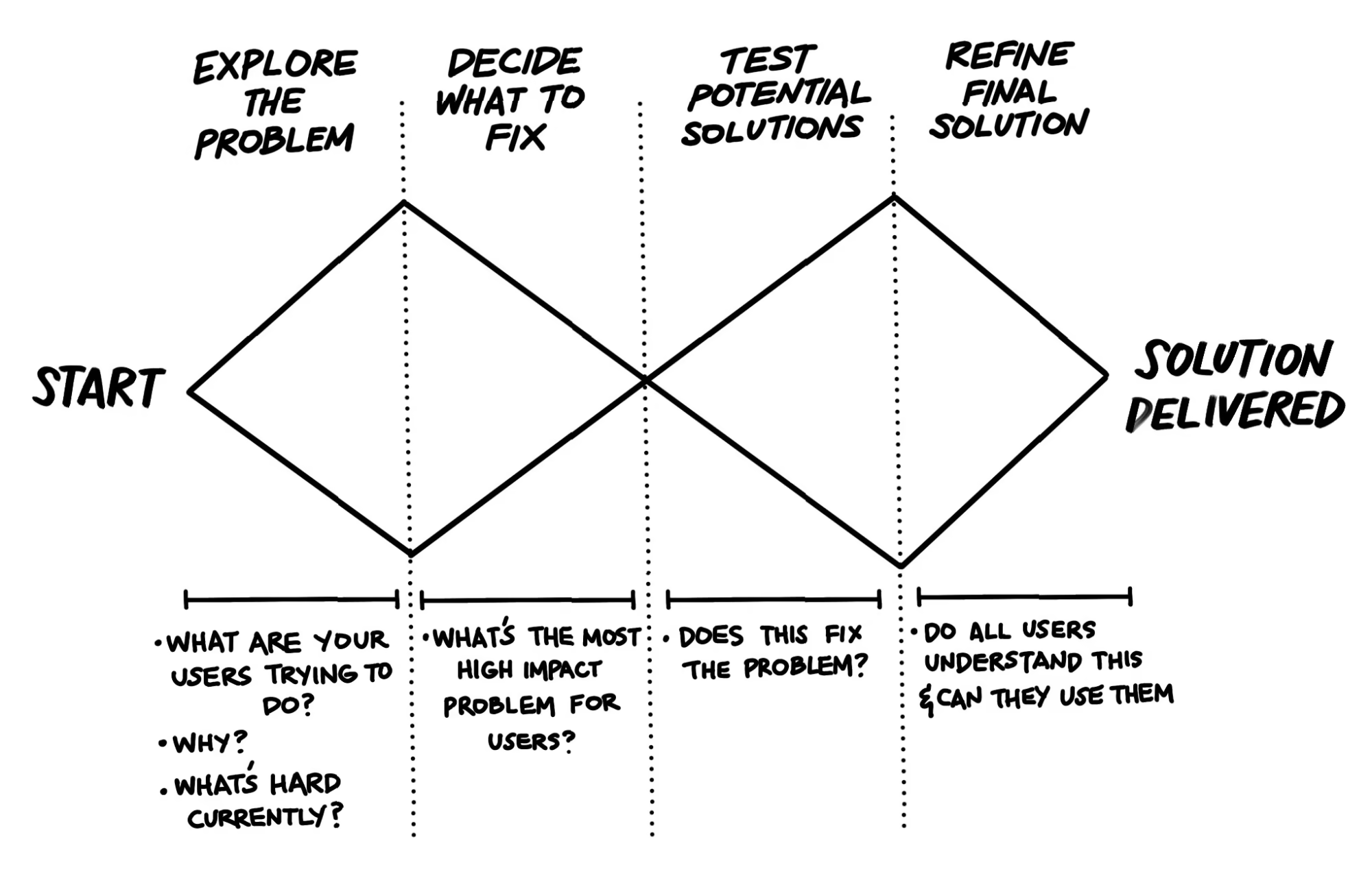
I used the Double Diamond — explore wide first, then narrow down. It suited this project perfectly because the problems were obvious on the surface but complex underneath. The average customer is a farmer in his late 50s, shopping from the field or barn, on a phone, with limited time and limited patience for a confusing website. Every decision I made kept him in mind.
I didn't want to assume anything. So before touching the design, I spent time understanding exactly what was going wrong and why.
Identified key usability issues including unclear navigation, mismatched visuals, cluttered layout, and lack of customer support options — pointing to a need for improved organisation, design consistency, and clearer menus.
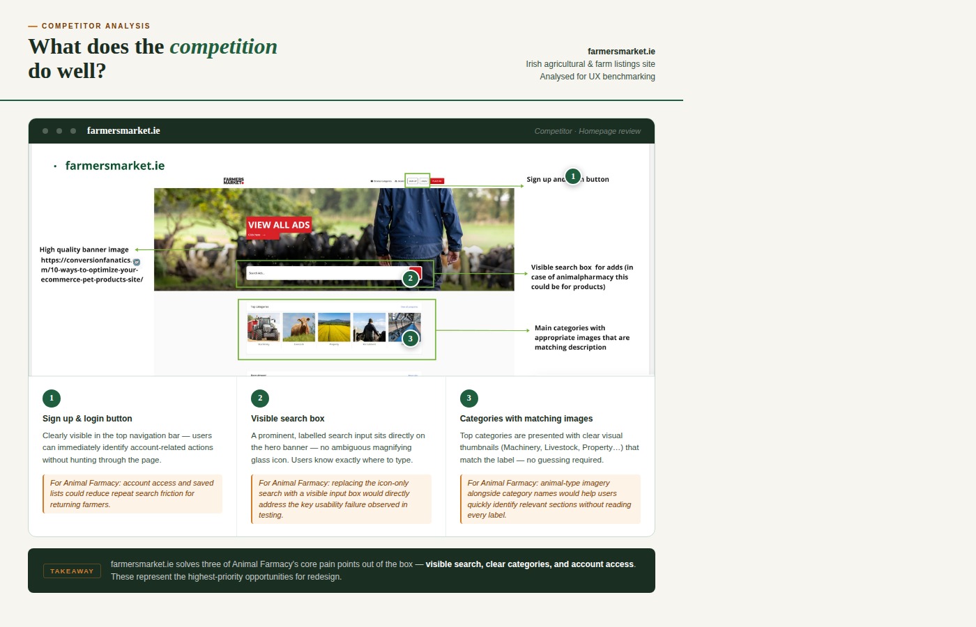
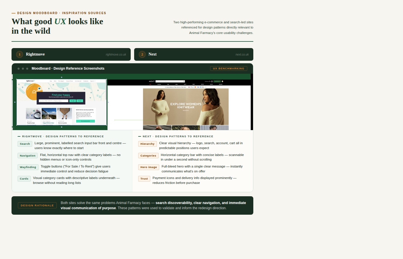
Analysed best practices from similar e-commerce platforms in Ireland and globally — including Valley Vet, Farmers Market, Next, and Chupi — to identify what good navigation, search tools and product pages look like.
Conducted with farmers and farming-related users aged 25–65+ to understand their online shopping behaviour, mental models around product categories, and attitudes towards digital tools.
Extracted the most relevant UX guidelines and best practices for e-commerce websites — with a particular focus on accessibility standards and navigation patterns for older users.
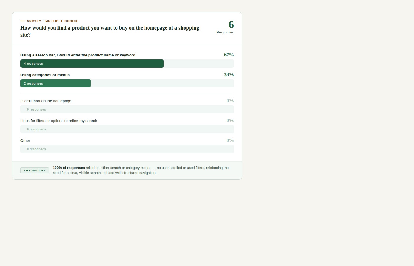
Focused on two key tasks: finding a specific product using the available search tools, and locating shipping information. Sessions revealed consistent patterns of frustration around the search bar and menu labels.
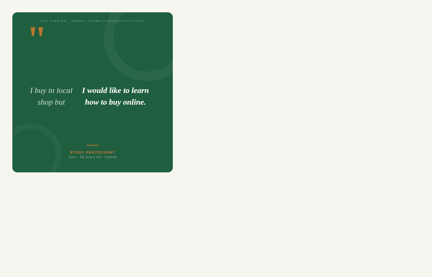
"If someone doesn't see the menu, they can always use the search bar."
"I would put calf jacket under the farm equipment."
.png)
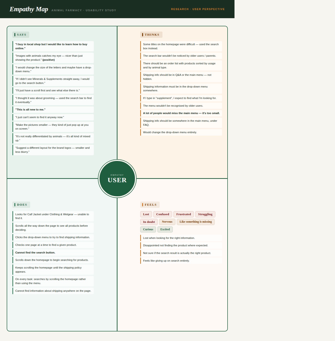
Once the research was done, I needed to get under the skin of the user — not just what they did, but how they felt doing it. The empathy map made that clear.
I built three personas. But one kept coming back to me — Jack. He's the user who stands to gain the most from getting this right.
Every persona pointed to the same thing. So I had my focus.
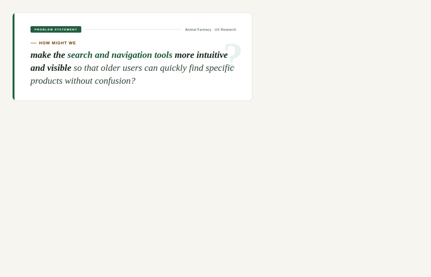
Problem defined. Now I needed to figure out how to actually fix it.
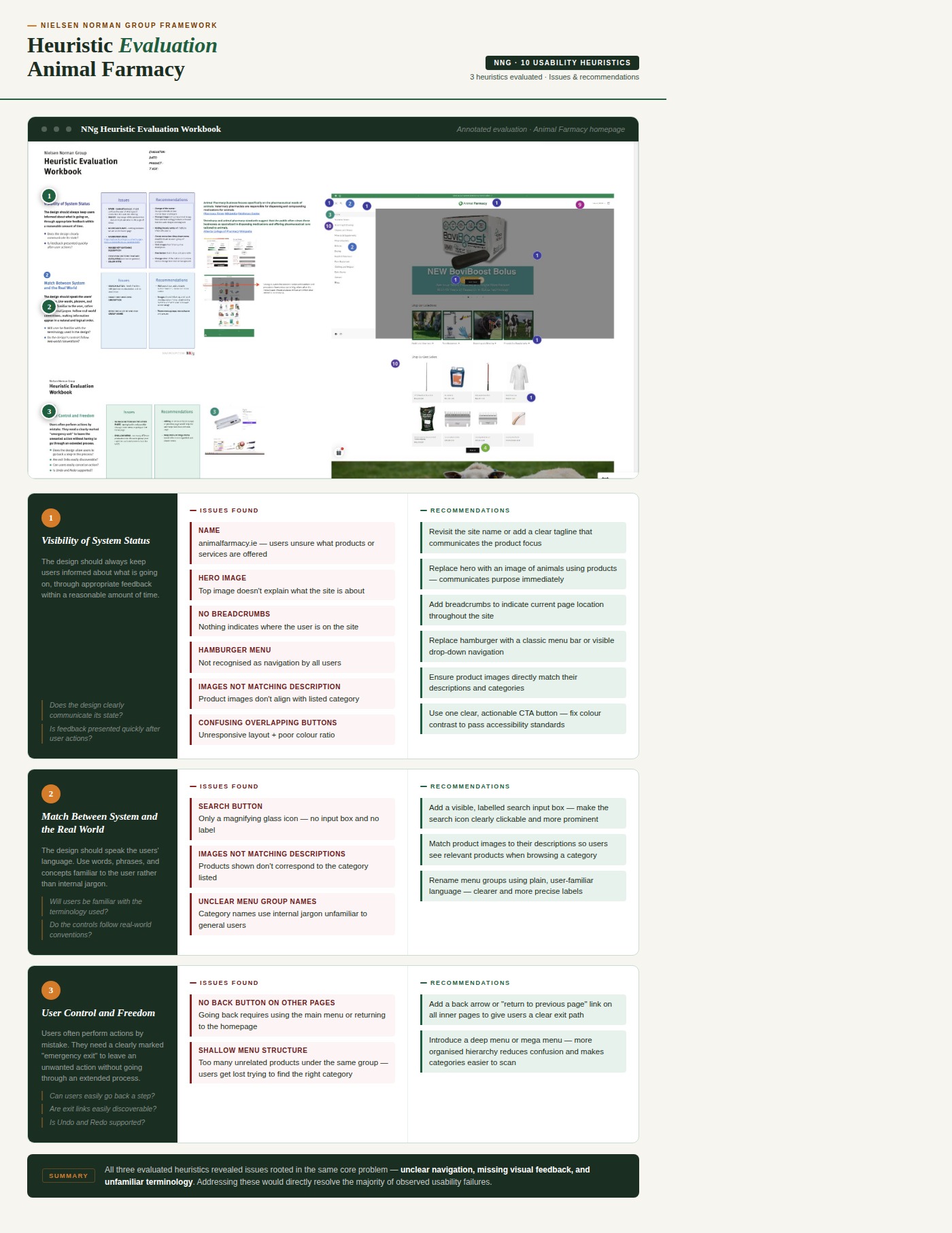
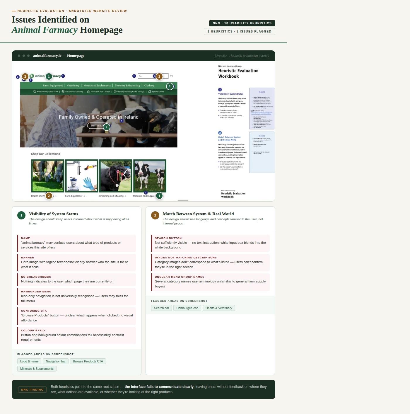
During research and early paper prototyping, the Animal Farmacy homepage changed. I contacted the stakeholder and received their own usability report — which I compared directly with my own findings to validate and extend the analysis.
I also ran a second heuristic evaluation on the new homepage. The verdict? Very little had actually improved when it came to search and navigation.
Before sketching anything, I looked at what good actually looked like — search bars that worked for real people, with instructions built in and contrast that passed accessibility standards.
WebAIM Contrast Checker — foreground #0D512C on background #121212 fails all WCAG AA and AAA standards.
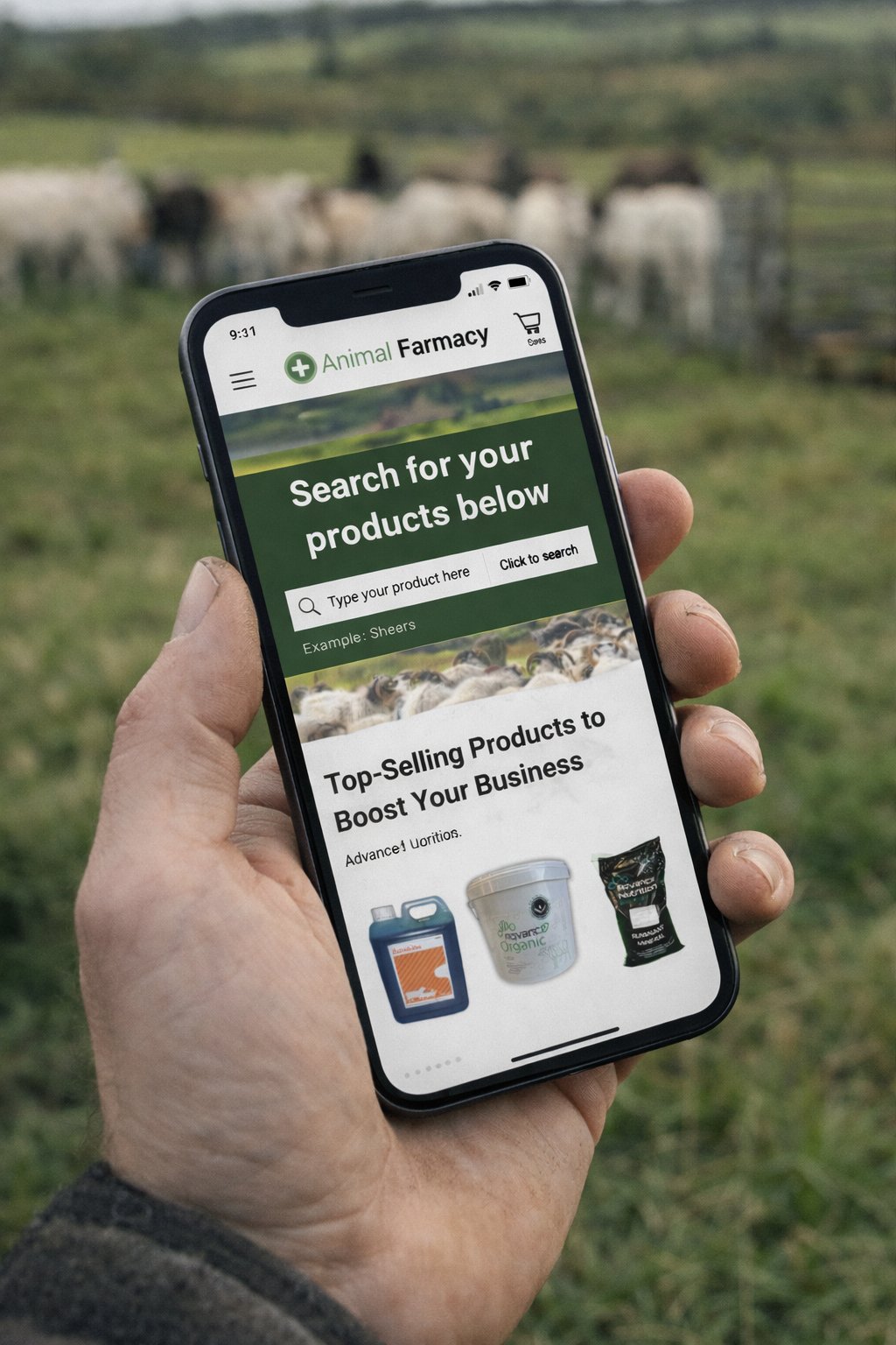
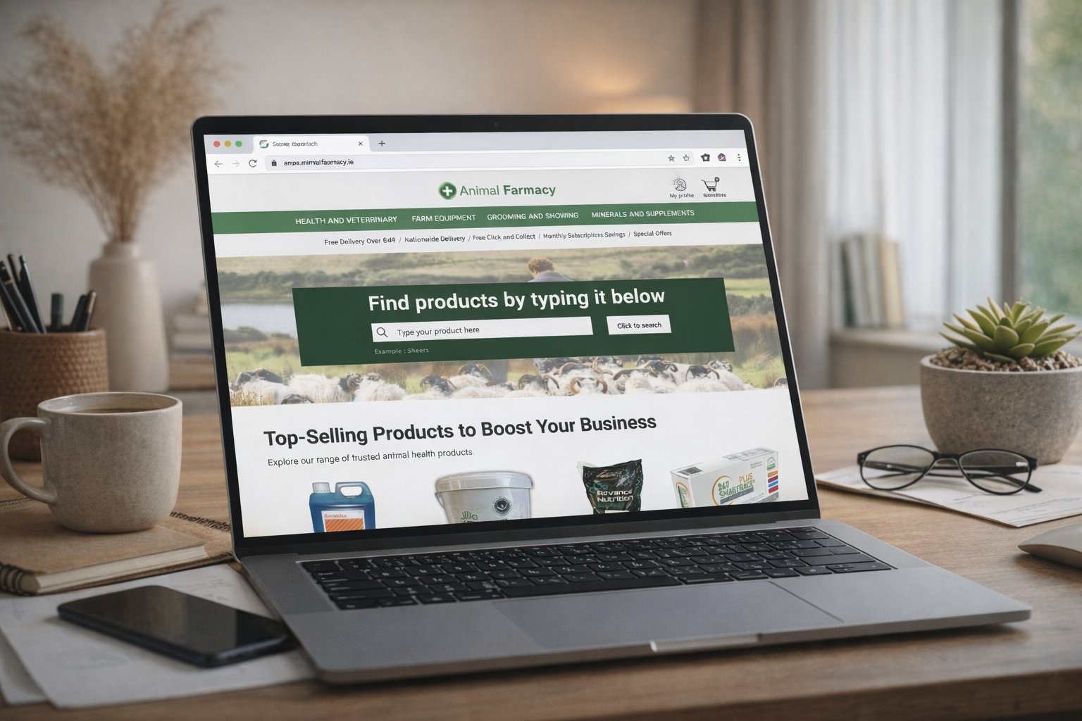
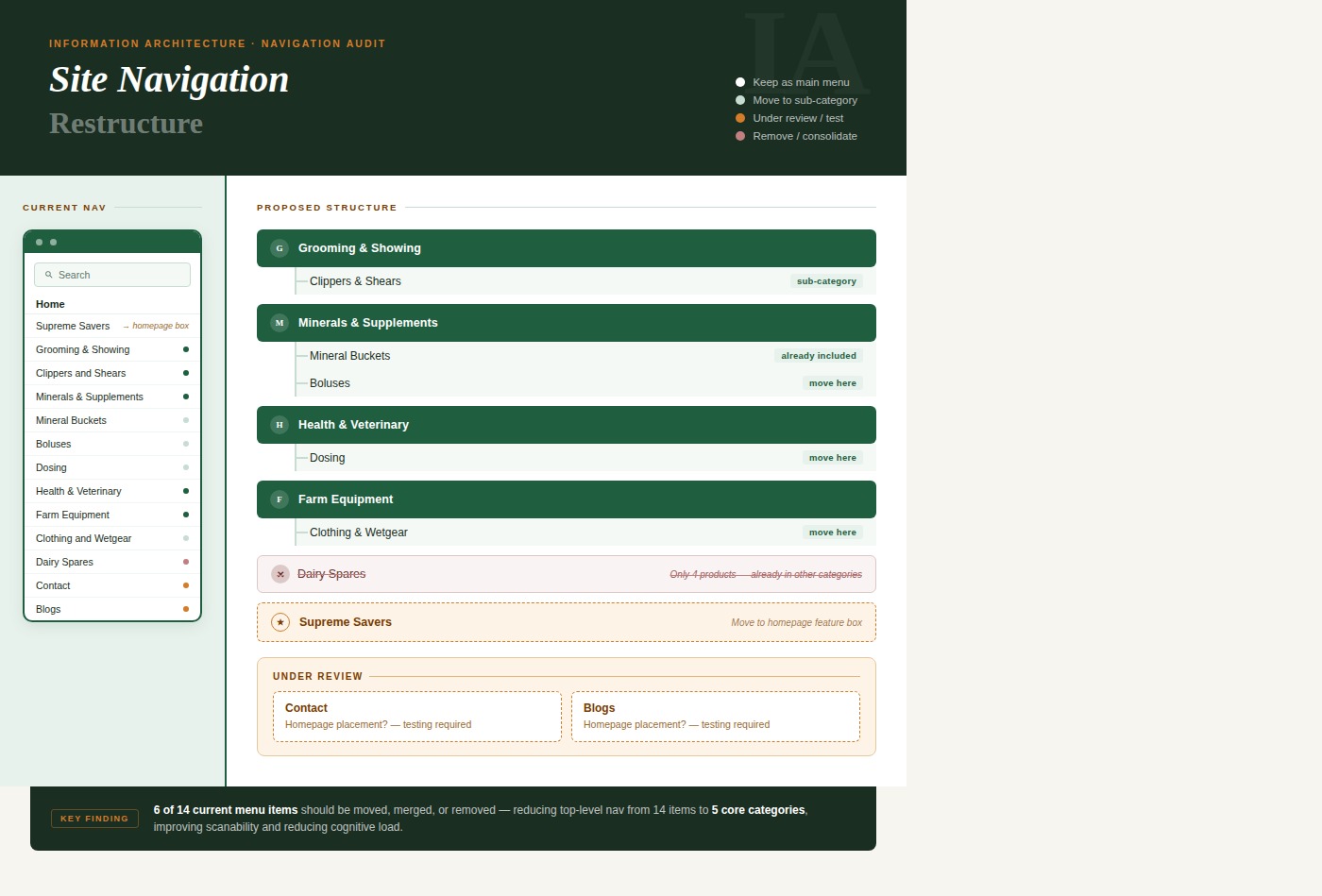
Although my primary focus was the search tool, usability testing showed that users expected certain categories to be visible directly on the homepage — not hidden behind a hamburger menu. I reorganised the architecture into 4 main visible categories.
Four versions. Each one testing a slightly different approach to search visibility and menu structure. Old school, but it works.
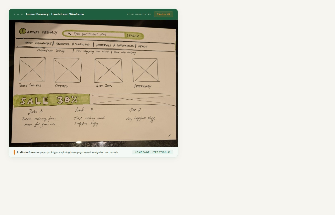
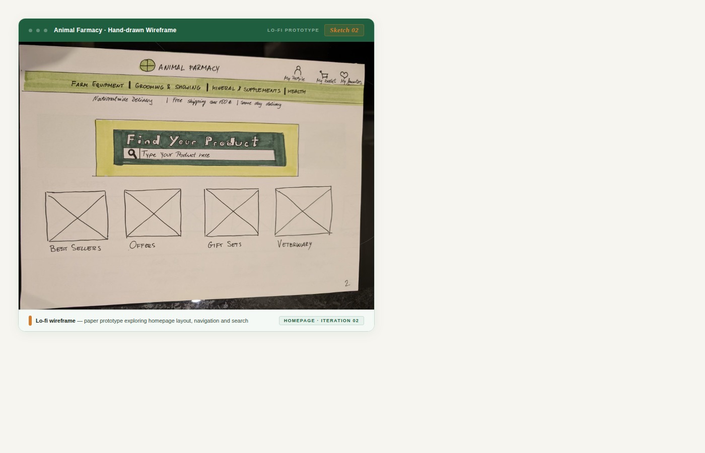
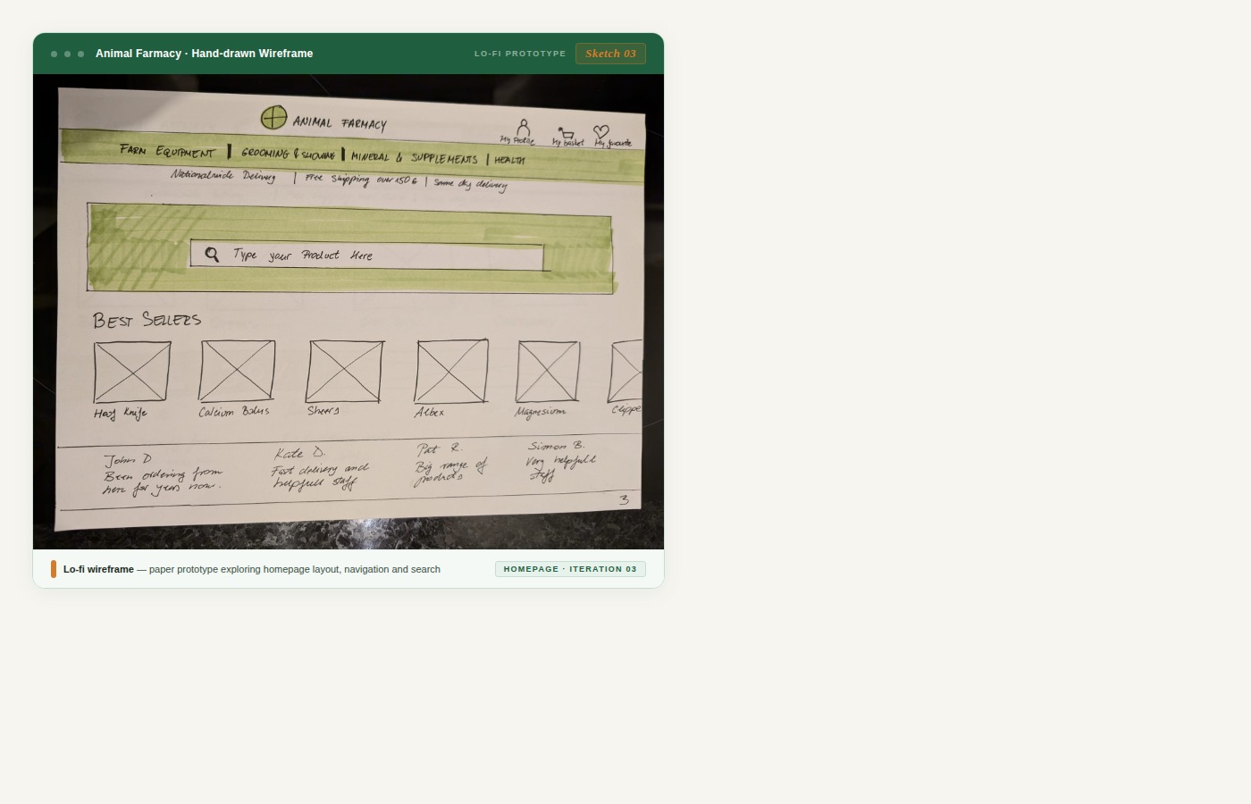
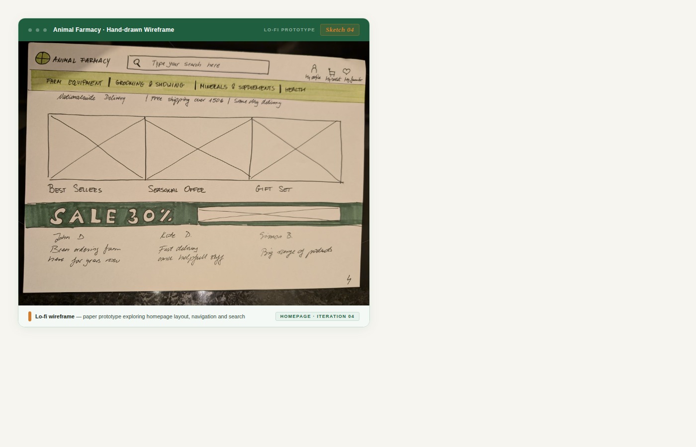
I grabbed my paper prototypes and headed to my workplace. Some of the people I tested with were older — a couple had even worked on farms. I mixed up the order of questions to reduce bias and get cleaner results.
One prototype won — clearly. Users found the search bar faster and with more confidence. That became the direction.
Time to make it real. Everything from the research, the testing, the stakeholder report — it all went into this.
🎨 View Figma Prototype →
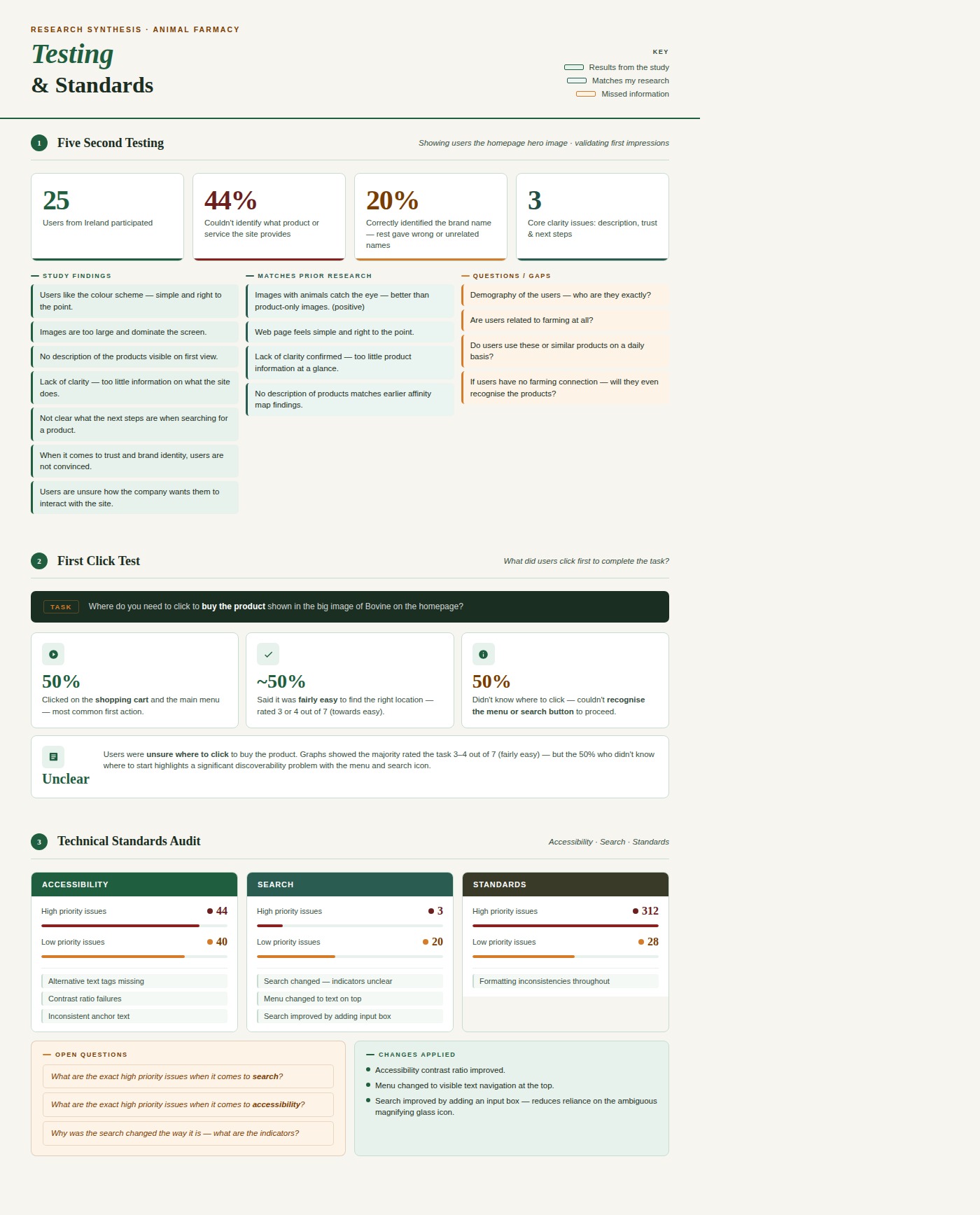
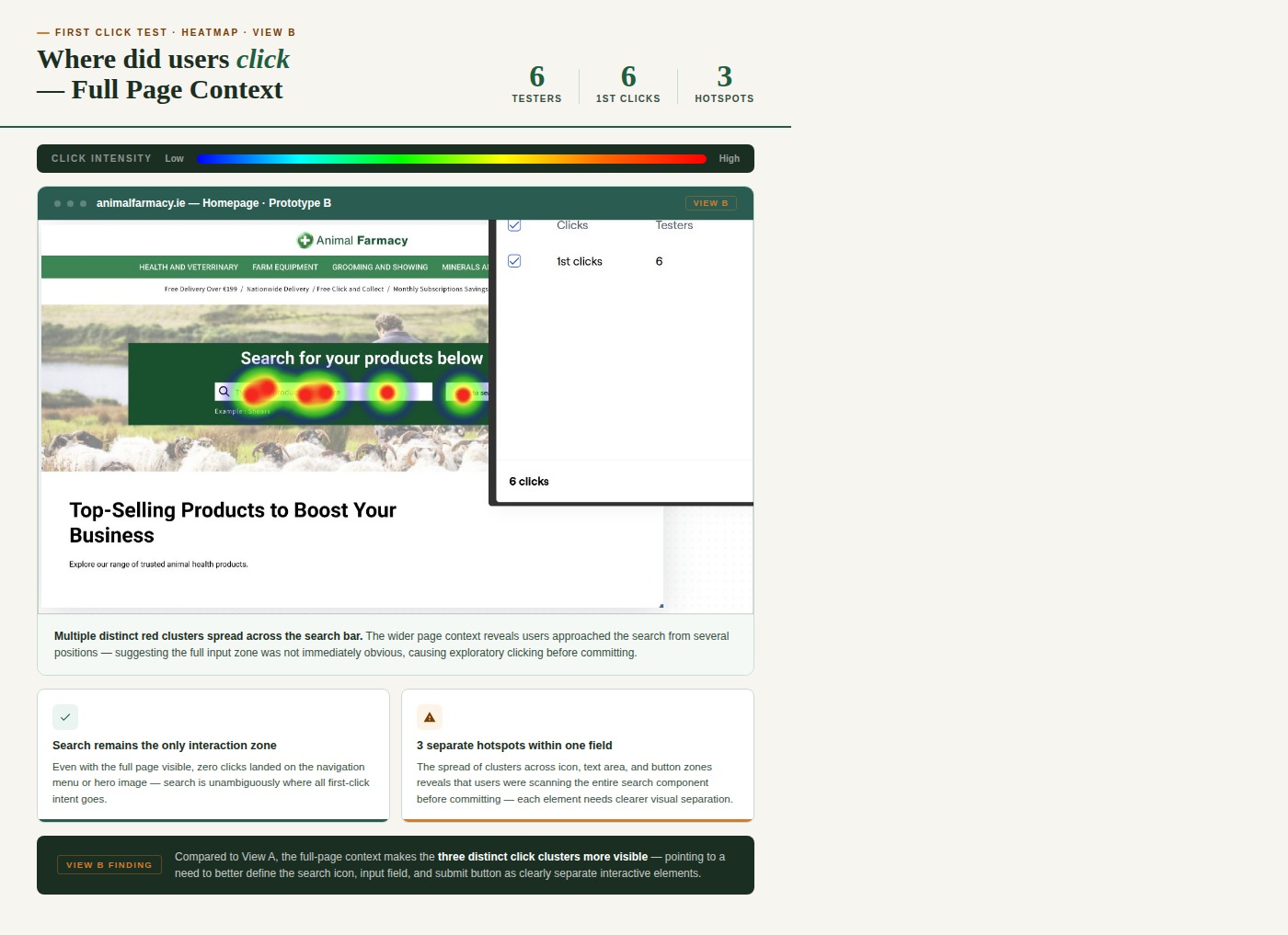
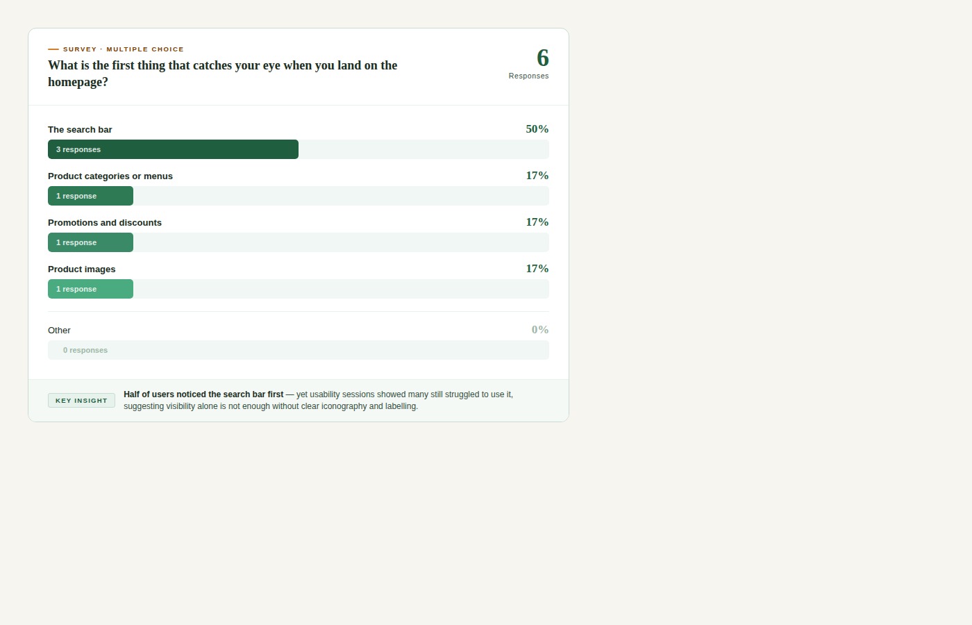
Six users. All tasks completed. All questions answered. Here's what the data showed.
Where would you click first, on the homepage, to start your search for sheep supplements?
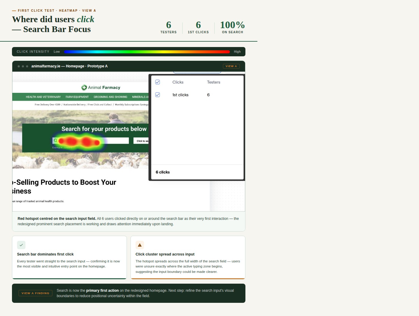
Can you find and click on the search bar (where you would enter the product you are looking for)?
"I think it's fine as it is."
"Maybe put it in the middle of the screen and have top selling products on top?"
"It was easy to find it."
"It looks great where it is now."
User feedback confirmed the redesigned search bar was significantly easier to find and use — the core objective of the project was met.
Working on the Animal Farmacy homepage revealed complex challenges around search functionality, navigation, and accessibility. By focusing on real user feedback — through interviews, surveys, and usability testing — and aligning closely with accessibility standards, I created a redesign that helps users locate search tools more easily and navigate the platform with greater confidence.
These changes form a strong foundation for future improvements, including AI-powered search and personalised recommendations — keeping the platform user-friendly, competitive, and business-successful.
Designing for older, less tech-savvy users improved the experience for everyone — accessibility is universal.
A search bar is only useful if users can find it. Visibility and affordance matter more than aesthetics.
How you label and group things directly determines whether users find what they need — or give up.
Guerilla testing with actual farmers caught insights no assumption could — get out of the building.
Even the client's own redesign had unresolved issues — always evaluate what exists, not what you're told.
UX Research & UI Design · 2024
.png)